
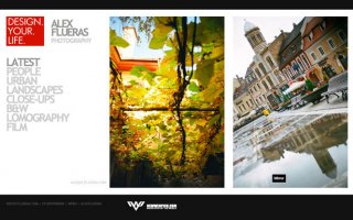
Alex Flueras
Alex Flueras’ portfolio uses a clean black and white color scheme, which causes his photographs to stand out. The typography-based navigation menu on the left side of the layout is used to view different types of his work, you can then scroll sideways to view the works in each category. A great jQuery effect is used which allows you to click on the next image which, once clicked, smoothly scrolls to the left side of the page for you.
Rebecca Ruth
Rebecca Ruth’s portfolio is based on an HTML and CSS layout, although Flash is used to create an elegant slider. The use of a calligraphy style font adds more elegance to the portfolio, and the low-opacity floral patterns add a bit of depth to the design.
Robert Dann
Robert Dann makes great use of texture in his portfolio to add depth to the overall feel of the design. He uses the same hot and vivid pink found in his logo throughout his design which helps add that little something extra to the design. The portfolio area uses a classy jQuery slider, adding a little touch of style to the site’s usability.
Maurice Krijtenberg
Maurice Krijtenberg makes use of his photography skills in his portfolio design, putting the message across that he is a photographer right from the word go. His photographic work is showcased in a photo frame; to view the next piece of work you simply click and a cool jQuery effect kicks in to play and does its job to smoothly scroll the image sideways to reveal the next photograph.
John Morris
John Morris has gone for the elegant and clean look, which is always a good choice if you’re a wedding photographer! The minimal white color scheme works perfectly with the style of photos and makes them stand out like there’s no tomorrow. Yet again, another jQuery effect has been used, this time to add an elegant smooth faded effect to the front page slide-show.
 Sandy Carson
Sandy Carson’s portfolio is another minimalistic one, making use of white-space to bring out the best in his photographic work. The portfolio pages make good use of a jQuery thumbnail gallery, allowing you to select just the photos you want to see rather than having to view them all, although you most probably will view them all anyway!
Mauro Poltronieri
The faded damask style texture used in the background of Mauro Poltronieri’s one-page portfolio adds great depth, making the site much more visually appealing. The scroll effect on the portfolio of images itself is very smooth and adds a elegant feel to the design; the images can be clicked on and opened up to view the full-size image in a beautiful jQuery light-box.
Daniel Woolf
Daniel Woolf makes use of a lovely striped images on the left-hand side of his portfolio, adding tonnes of interest to the portfolio design itself. The portfolio section of the site uses a jQuery thumbnail gallery that fits in perfectly with the sites overall design.
Sunny Shen
Sunny Shen’s portfolio uses a very limited color scheme and makes use of rounded corners to make the square-cornered images stand out well. The portfolio section of the site is slightly outdated and doesn’t make use of slide-shows or any jQuery effects, however it displays well and it’s easy to find what you’re looking for.
Buddhabong
Buddhabong’s portfolio uses some really modern trends such as repeated striped background patterns, jQuery effects and a minimalist but effective and stunning navigation menu.
 Andrew Gransden
Andrew Gransden’s HTML and CSS based portfolio uses some great rollover link effects in the navigation menu which is very easy to use and find your way around the site. The portfolio area of the site uses a popular, but well used jQuery light-box, emphasizing the quality of the photography.
Paulo Boccardi
Paulo Boccardi has such a simple portfolio, yet its elegance and simplicity make it absolutely perfect for his style of work, which stands out incredibly well. The portfolio area uses a great jQuery scrolling effect, making it simple to use and nice to look at.
Arild Danielsen
Arild Danielsen’s design uses great Flash-like JavaScript effects to make the site visually appealing and interesting to use. Thumbnails of the photos are enlarged in a pretty light-box when clicked on, allowing the viewer to view the photos at a larger scale.
Clouds 365 Project
The Clouds 365 Project is an incredibly interesting project, and has a superb “portfolio” to match. It uses a fantastic JavaScript effect that makes the slightly decreased-opacity images show their true color when hovering over them. Clicking on a thumbnail reveals a bigger version of the clouds, and like a blog, allows visitors to comment on their favorite photographs.
Ivan Vanderbyl
Ivan Vanderbyl’s photography portfolio uses jQuery rollover effects that reveal the name of a particular photo, as well as when it was taken. Clicking on one of the many thumbnails displayed on the front page takes you to another page, allowing you to view a larger version of the photo.
Rankin
Rankin is a huge and very well-known photographer, having photographed plenty of celebrities such as Madonna, Lindsay Lohan, Jay-Z, Ricky Gervais and many, many more. The portfolio design itself is very simple and minimalist, using a frame to present the actual photographs in a horizontal scroll-box.
Dave Hill
Dave Hill uses great jQuery effects in his portfolio to display a selection of washed-out thumbnails down the left-hand side, followed by a large preview of the selected thumbnail.
Alexander Henderson
The sleek, modern portfolio of Alexander Henderson uses a dark gray text to make the navigation menu on the left-hand side as subtle as possible. The thumbnails of the photos stand out incredibly well because of the very limited color-scheme, and when clicked are opened up in a beautiful light-box, allowing the user to view the photos at a good size.
Flash Portfolios
Using the latest Flash technology in portfolio design is a great way to display your work a little differently to those using HTML, CSS and JavaScript/jQuery. Although almost anything is possible, expect to pay a little more for custom Flash-based portfolios (if you’re not creating it yourself). One other bad point about Flash is it can’t be viewed on all computers and mobile devices, such as some older computers and iPhones.
YOU MIGHT ALSO LIKE


Share this Post
latest post
-
-
-
 History of advertising Photography October 10, 2016
 -
 Materials for pinhole camera October 7, 2016
 -
 Photojournalism photographers October 4, 2016
 -
 35mm nitrate film October 1, 2016
 -
 Photographic films September 28, 2016
 -
 One Colour Photographs September 25, 2016
 -
 Best compact digital camera for street photography September 22, 2016