 Knowing how to calibrate your monitor is critical for any photographer who wants accurate and predictable photographic prints. If your monitor is not correctly reproducing shades and colors, then all the time spent on image editing and post-processing could actually be counter-productive. This tutorial covers basic calibration for the casual photographer, in addition to using calibration and profiling devices for high-precision results. Furthermore, it assumes that tossing your old monitor and buying a new one is not an option.
Monitor
ADJUSTING BRIGHTNESS & CONTRAST
The easiest (but least accurate) way to calibrate your display is to simply adjust its brightness and contrast settings. This method doesn't require a color profile for your monitor, so it's ideal for casual use, or for when you're not at your own computer and need to make some quick adjustments.
The images below are designed to help you pick optimal brightness/contrast settings. A well-calibrated monitor should be able to pass both tests, but if it cannot, then you will have to choose which of the two is most important. In either case, make sure that your display has first been given at least 10-15 minutes to warm up.
(1) Mid-Tones. Having well-calibrated mid-tones is often the highest-priority goal. Such a monitor should depict the central square as being the same shade as the solid outer portion — when viewed out of focus or at a distance. The leftmost and rightmost squares should also appear darker and lighter than the solid gray, respectively.
© 2004-2015 Sean McHugh
Note: the above calibration assumes that your monitor is set to gamma 2.2.
 If the central square is lighter or darker than the outer gray region, your display is likely depicting images lighter or darker than intended. This will also have a noticeable impact on your prints, so it's something that should be addressed.
If you are using an LCD monitor, first set your display to its default contrast (this will likely be either 100% or 50%), then adjust the brightness until the central square blends in. If you are using a CRT monitor (the larger "old-fashioned" type), then instead set it to maximum contrast. For both CRT & LCD displays, make sure that these are set to gamma 2.2 if available (most current displays come with this as the native setting).
Note: increasing the brightness of your display too much can shorten its usable life span. You will likely not need to have your display at its maximum brightness if the room isn't too bright, if the display isn't back-lit (such as in front of a window) and if the display isn't too old.
(2) Highlight & Shadow Detail. If you've followed the previous calibration, now your mid-tones will be reproduced roughly at the shade intended. However, it may also mean that the shadows and highlights will appear too bright or dark, or vice versa. You should be able to distinguish the 8 shades in each of the two images below:
Shadow Detail Highlight DetailThe two adjacent shaded bands at each outer edge of this page should be just barely distinguishable. Otherwise you've likely reached the limit of what brightness/contrast adjustments alone can achieve. Alternatively, if maximal shadow and highlight detail are more important than mid-tone lightness, you can ignore the mid-tone image. In that case, first use brightness to control shadow detail and then use contrast to control highlight detail (in that order). When brightness is too high, solid black will appear gray, but when it's too low shadow clipping will make several of the darker 8 shades appear the same.
 However, the above examples are just crude adjustments that only address small portions of the tonal range, and do not fix colors at all. There are somewhat more accurate methods out there for visual calibration, but ultimately, achieving truly accurate results requires systematic and objective measurements using a calibration device...
OVERVIEW: CALIBRATION & PROFILING
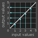
The colors and shades that a monitor reproduces vary with the monitor's type, brand, settings and even age. Unfortunately, unlike in the digital world, all numbers aren't created equal when it comes to monitors. A digital green value may therefore appear darker, lighter or with a different saturation than this color was intended to be seen:
| Digital Value
of Green |
Monitor
"X" |
Standardized
Color |
|
|---|---|---|---|
| 200 | |||
| 150 | |||
| 100 | |||
| 50 | |||
| ← Color Mismatch → | |||
note: for the purposes of this example, "standardized color" is just one example of a desirable state that is well-defined in terms of universal parameters, such as gamma, white point and luminance.
Ideally, you would get your monitor to simply translate the digital values in a file into a standardized set of colors. However, this isn't always possible, so the process of monitor calibration actually requires two steps: (1) calibration and (2) profiling.
(1) Calibration is the process of getting your monitor into a desirable and well-defined state. This usually involves changing various physical parameters on your monitor, such as brightness from before, in addition to creating what is called a Look-Up Table (LUT).
The LUT takes an input value, such as green=50 in the above example, and then says "on 'Monitor X, ' I know that it reproduces green=50 darker than the standard, but if I convert the 50 into a 78 before sending it to the monitor, then the color will come out how a green=50 was intended to be seen." An LUT therefore translates digital values in a file into new values which effectively compensate for that particular monitor's characteristics:
| Digital Value
of Green |
LUT | Compensated
Digital Values |
Monitor
"X" |
Standardized
Color |
|
|---|---|---|---|---|---|
| 122 | |||||
| 113 | |||||
| 78 | |||||
| ← Colors Match → | |||||
(2) Profiling is the process of characterizing your monitor's calibrated state using a color profile. These characteristics include the range of colors your monitor is capable of displaying (the "color space"), in addition to the spacing of intermediate shades within this range ("gamma"). Other properties may also be included.
YOU MIGHT ALSO LIKE


Share this Post
latest post
-
-
-
 History of advertising Photography October 10, 2016
 -
 Materials for pinhole camera October 7, 2016
 -
 Photojournalism photographers October 4, 2016
 -
 35mm nitrate film October 1, 2016
 -
 Photographic films September 28, 2016
 -
 One Colour Photographs September 25, 2016
 -
 Best compact digital camera for street photography September 22, 2016